%20--%3e%3csvg%20version='1.1'%20id='Layer_1'%20xmlns='http://www.w3.org/2000/svg'%20xmlns:xlink='http://www.w3.org/1999/xlink'%20x='0px'%20y='0px'%20viewBox='0%200%2016.4%2036'%20style='enable-background:new%200%200%2016.4%2036;'%20xml:space='preserve'%3e%3cstyle%20type='text/css'%3e%20.st0{fill:%234A4C4C;}%20%3c/style%3e%3cg%3e%3cpath%20class='st0'%20d='M1.5,24.4c1.1,0,1.5-0.6,1.5-6.8c0-0.8,0-4.1,0-4.1s1.2-0.3,1.2,3.1S4,23,4,25.7s0.8,5.9,4.2,5.9%20c2.7,0,3.7-2,4.1-3.7c-0.8,1.2-2.4,1.5-3.5,1.5c-1.7,0-2.4-1.5-2.4-2.7c0-3.8,0.8-6.4,0.8-9.3c0-4.7-3-5.5-4.2-5.5%20c2,0,1.9-6.3,5.2-6.3C10.6,5.6,12,8,12,9.5c0.2,0,0.4-0.8,0.4-1.8C12.4,5,11,3,8.2,3C5.4,3.1,4.5,5,3.9,6.9%20C3.4,8.2,3.1,9.4,3.1,9.4c0-2.8-0.1-7.9,3.7-7.9c0.4,0,0.8-0.2,0.8-0.8C7.6,0.4,7.3,0,7,0C1.5,0,0,2.4,0,17.7%20C0,23.9,0.5,24.4,1.5,24.4z'/%3e%3cpath%20class='st0'%20d='M16.4,18.2c0,16.2-3.7,17.8-8.2,17.8c-6.6,0-7.7-4.5-7.7-8.6c0-1.3,0.6-1.7,1.1-1.7s1,0,1.3,0.9%20c0.5,2.3,1.1,6.9,5.5,6.9c5,0,5.8-5.6,5.8-8.8c0,1-2,2.7-4.2,2.7c-1.6,0-1.9-1.4-1.9-2.3c0-3.7,1-5.5,1-10.9c0-2.1-1.7-2.8-3-2.8%20c0.8,0,1-3,2.9-3c2.2,0,2.8,2.6,2.8,4.9c0,3.8-0.8,5.7-0.8,8.7c0,1,0.3,2.1,1,2.1c0.9,0,2.2-0.9,2.2-2.1V11.8%20c0-7.5-1-10.4-4.3-10.4c-0.5,0-1-0.1-1-0.9C8.7,0.2,8.9,0,9.3,0C15.1,0,16.4,1.4,16.4,18.2z'/%3e%3c/g%3e%3c/svg%3e)
Jan 9, 2026
Tech is enamoured with natural language these days, but not in a way that sparks my imagination and excitement. I don’t want to look into the cold, blinking mouth of a chatbot and try to exercise my artistic creativity through a simulated conversation.
Instead, I’ve always been interested in using code to celebrate what’s already rich and beautiful to me about language — the structures inherent in the technology, the miracle of understanding each other’s complicated sentences and fragments, how full of meaning and ritual the whole dance can be.
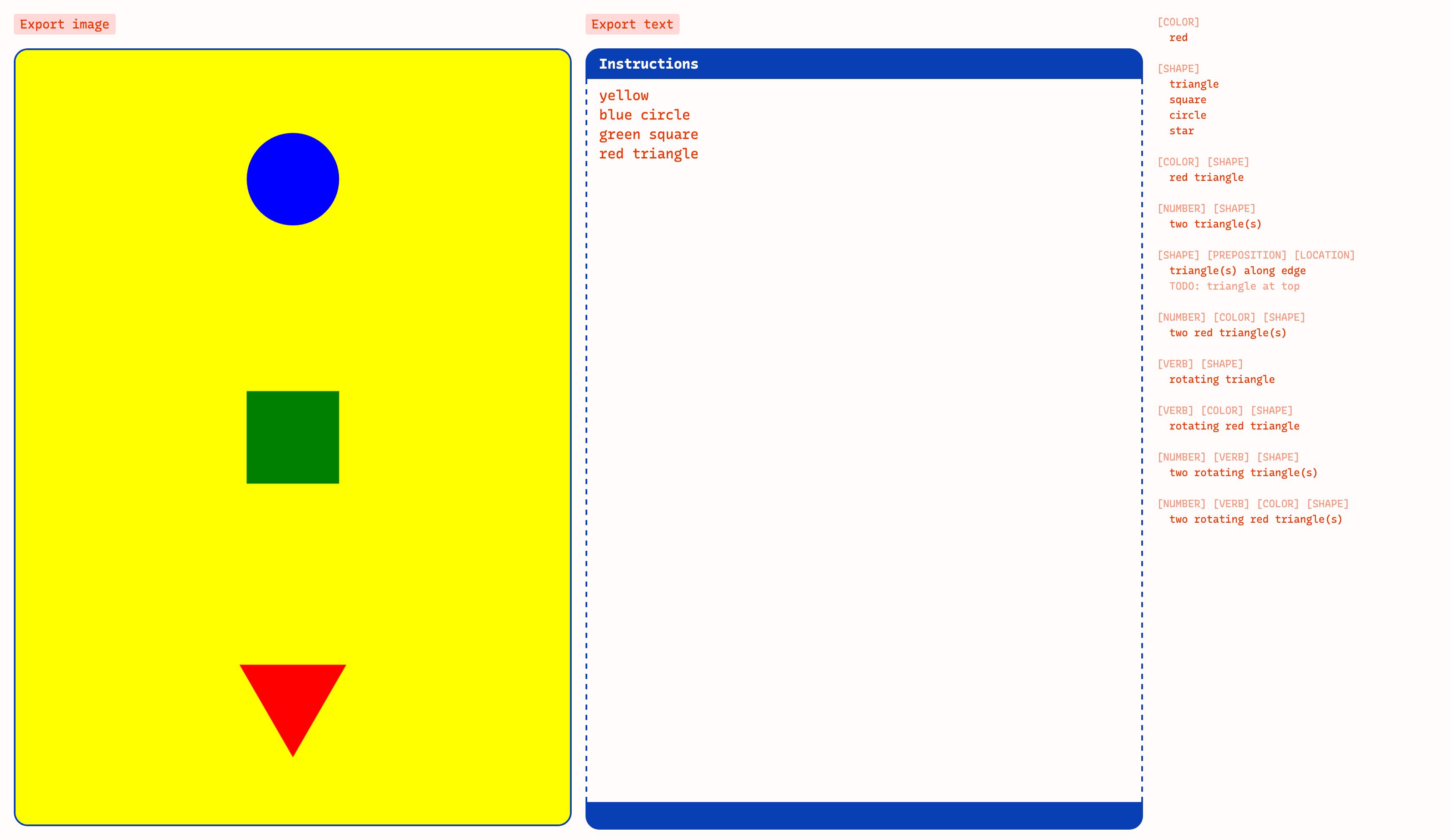
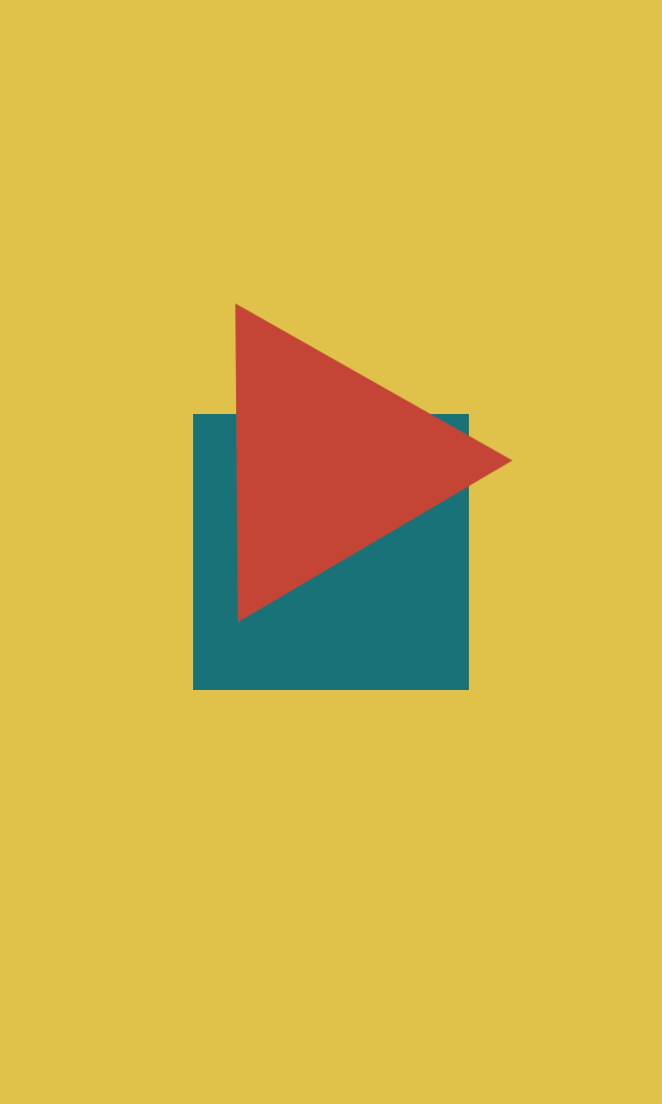
This pattern language interprets a limited set of natural language instructions to paint a graphical picture. Write the word “triangle” and out pops a triangle on the screen. Call it a “red triangle” and the picture adjusts accordingly.
In contrast to a typical graphics programming library, the tool is heavy on constraints. You can only use six colors and a handful of shapes. But when we’ve stripped language down to this set of parameters and we start to play with them, interesting questions start to puddle out, like: what do color words mean?
Colors
In the first iteration, any of the approximately 150 CSS named colors were recognised, so you could have a “rebeccapurple square” or a “palegoldenrod triangle". Colors written in the text box were plugged straight into ctx.fillStyle.
I tend to have a soft spot for playing with the raw materials of the web, so I was happy playing with this for a while. But with some feedback from my coworkers, I decided to try limiting the color palette and was really delighted by the results.
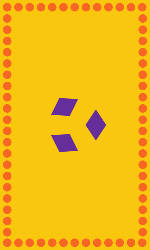
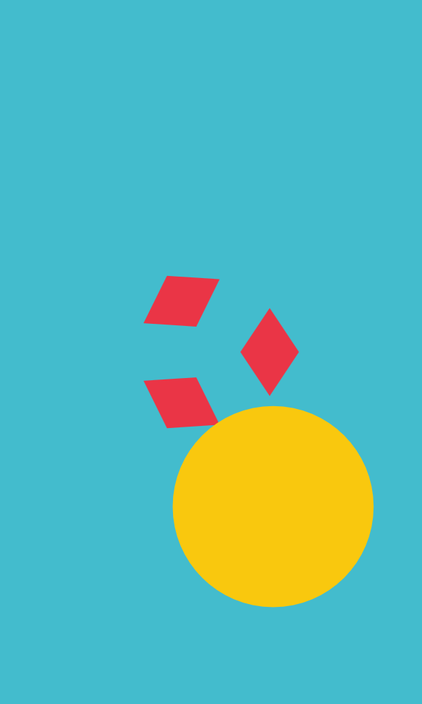
The current version only allows for six named colors: red, orange, yellow, green, blue, and purple — the primary and secondary colors on the color wheel. This gave me an opportunity to decide what exactly “red” or “blue” should mean.
Instead of using hard and raw values like #ff0000 for “red”, maybe “red” could be a variable that had a handful of possible values. It could mean #ea3546 or #e58383 or #c44536, which are the values of “red” from the palettes currently in the tool.
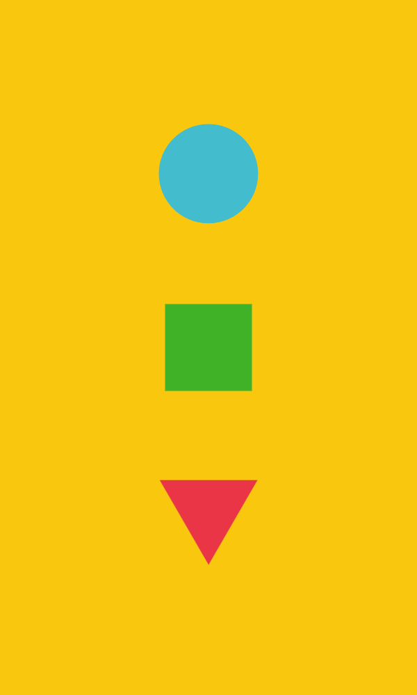

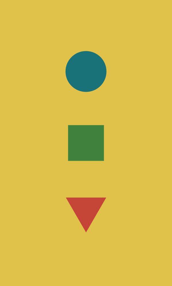
Viewing the same shapes and colors through different palettes suddenly casts a completely different mood and feel over the picture.
Layout
The layout engine is currently very straightforward. It lays every shape or group of shapes in a vertical line from top to bottom, reflecting the order of the text. (A fun side effect of this is that while the text primarily serves as the code or instruction for the graphic, it also happens to function as the corresponding alt text!)
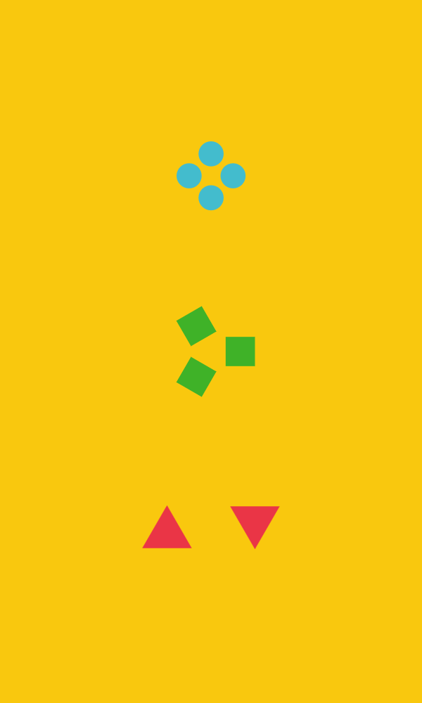
Adding a count will generate copies of the shape and arrange them in a circle, applying rotation.
Specifying “along edge” will create a border with that color and shape.
More recently, I began loosening the reins to play with a tiny bit of randomness: use the keyword “anywhere” to take a shape out of the vertical layout and place it randomly on the canvas. It's still so simple, but the effect kind of thrilled me. Having stared at the strict vertical arrangement of one to three shape patterns for so long, just this tiny bit of randomness and juxtaposition felt like a reward.
This layout system would be pretty adaptable to a landscape orientation — just lay the shapes out in a horizontal line instead of a vertical one.
I think the next challenge here would be to figure out if there’s a systematic way to allow for more flexibility in composition. I have plans for a little bit of variation in size (“small” and “big” keywords), but how could you get different layouts and combinations of layouts? Could you arrange shapes diagonally, in a repeating pattern background, overlay patterns on top of each other, assemble complex column and row layouts?
The hard part is always pulling back from seeing the possibilities and deciding what the useful boundaries of the system should be.
Speaking of the system…
How does it work?
In my first iteration, I used some pretty rough code to “parse” the text, line by line, identifying recognisable words and using those to build the shapes on the canvas.
After I hit a wall with that, I went back to write a proper parser, using what I had learned when writing Coem but trying to follow a different tutorial this time. This isn’t a traditional programming language, but materials like these, combined with some rusty knowledge from syntactic linguistics classes, help me understand how programming languages work and how I can use that to build something useful for my purposes.
The parser first runs through the text to build a stream of tokens. Then, it creates meaningful groups out of those tokens, building an object for each pattern, modelled after noun phrases in language.
The text “a slowly rotating red square” becomes:
[
  {
    "type": "det",
    "value": "a"
  },
  {
    "type": "vp",
    "vp": {
      "adv": "slowly",
      "verb": "rotating"
    }
  },
  {
    "type": "adj",
    "value": "red"
  },
  {
    "type": "noun",
    "value": "square"
  }
]
That’s the system for now! There’s so much that I feel like I could play with, but I’m excited to put it down and share what I have.
A list of possible things I have written down to think about:
-
Multiple palette options- Maybe option to add your own palette?
“anywhere” keyword for random placement and rotation — introducing a tiny bit of randomness-
“small”/“big” keywords for a little bit of control over size
- with slider for control over what that means!
- Experimenting with other movement/animation verbs
- Experimenting with a wider variety of layouts and more flexibility in composition
- Debug mode, or a way to see the parse tree
- Export image with text overlaid/at the side
- Option for landscape orientation instead of portrait orientation
- Export SVG